
How to Match Pocket Squares With Ties

Table of Contents
- Why Coordination Matters More Than Exact Matching
- The Core Principle: Complement Rather Than Copy
- Tie and Pocket Square Combinations That Work
- Pocket Square Colour Combinations for Every Suit
- Pocket Square Patterns With Ties: A Practical Approach
- How to Fold a Pocket Square and Display It Correctly
- Common Mistakes to Avoid
- Frequently Asked Questions
Last Updated: October 21, 2026
Why Coordination Matters More Than Exact Matching
Learning how to match pocket squares with ties isn't about finding pieces that look identical. Most men treat these accessories as separate choices, pick a tie, then grab whatever pocket square is nearby.

When you match pocket squares with ties properly, you elevate your entire outfit. The difference between a rushed look and a refined one often comes down to these small details. The right coordination transforms formal wear from acceptable to memorable.
The key insight: coordination and matching are not the same thing. Matching means identical or nearly identical. Coordination means the pieces speak to each other through colour, scale, or complementary design.
Think of it as a conversation between your accessories. They should acknowledge each other, not compete.
The Core Principle: Complement Rather Than Copy
Your pocket square and tie should enhance each other, not disappear into sameness. The strongest formal looks use contrast strategically. A bold tie needs a simpler pocket square. A quiet tie can carry a patterned square. This principle applies across every formal occasion, from weddings to business dinners.

Coordinating colours between tie, pocket square, shirt, and suit
Colour coordination starts with understanding your base. Your suit and shirt set the stage. A charcoal suit with a white dress shirt is neutral territory, almost any tie and pocket square will work. A navy suit with a light blue shirt narrows your options but gives you clear direction.
The rule: your pocket square should pull a colour from your tie, your shirt, or your suit. Never introduce a completely new colour that doesn't exist elsewhere in your outfit.
Warm colours (reds, golds, oranges) pair naturally with each other. Cool colours (blues, purples, greys) do the same. When mixing warm and cool, use a neutral, cream, white, grey, or black, as a buffer. This prevents your outfit from looking chaotic.
Using complementary or related colours
Complementary colours sit opposite each other on the colour wheel. A navy tie pairs beautifully with a gold or cream pocket square. A burgundy tie looks sharp with a pale yellow or champagne square.
Related colours, those next to each other on the wheel, offer a subtler approach. A blue tie with a teal or navy pocket square feels cohesive and intentional.
The texture of your fabric matters here too. A silk tie in deep blue looks different from a cotton tie in the same shade. Silk catches light and appears richer.
Tie and Pocket Square Combinations That Work
Real outfits teach better than rules. Here are combinations that work across formal settings.
Pairing solid ties with patterned pocket squares
A solid tie is your safest foundation. It gives a patterned pocket square room to shine without visual conflict.

The pattern in your square should be smaller in scale than the pattern would be if your tie were patterned. Small checks work. Large florals don't.
Our Red Silk Tie Pocket Square Cufflinks Set demonstrates this principle. The tie is a clean burgundy. The matching pocket square carries a subtle floral pattern in the same colour family. Together, they create depth without confusion.
Solid ties also work with solid pocket squares in different shades. A navy tie with a lighter blue pocket square creates subtle contrast. A burgundy tie with a cream pocket square offers more dramatic separation.
Pairing patterned ties with simpler pocket squares
When your tie carries pattern, your pocket square should step back. A striped tie needs a solid pocket square. A checked tie pairs with a solid or very subtly textured square.
This isn't a hard rule, it's about visual balance. Your eye can process one busy element easily. Two competing patterns create noise. A patterned tie with a solid pocket square in a related colour creates intentional style.
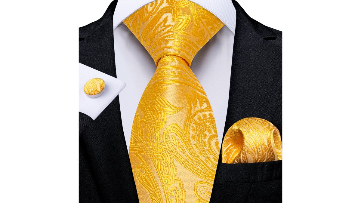
The Gold Paisley Tie Pocket Square Cufflinks Set shows this at work. The tie features intricate paisley detail in gold. The pocket square in the set is coordinated to complement without competing. At NZD $34.50, it's a complete solution that removes guesswork.
Pocket Square Colour Combinations for Every Suit
Your suit colour determines which pocket square colours work best.
Charcoal or Grey Suit: Pair with navy, burgundy, cream, or gold. These colours pop against grey without clashing. A white pocket square also works for maximum formality.
Navy Suit: Cream, gold, burgundy, or a lighter shade of blue all work. Navy is forgiving because it's neutral enough to accept warm and cool tones.
Black Suit: White, cream, burgundy, or gold. Black is formal and demands crisp contrast. Avoid muted tones, they disappear against black.
Brown or Tan Suit: Gold, cream, burgundy, or forest green. These warm-toned suits pair best with warm colours or neutrals.
Balancing patterns and avoiding competing prints
Pattern clash happens when two patterns have similar visual weight and compete for attention. A bold striped tie with a bold checked pocket square creates visual chaos. The solution is scale and contrast.
If your tie has large-scale pattern (wide stripes, big checks), use a small-scale pattern in your pocket square (tiny dots, fine lines). If your tie has small-scale pattern, you can use a slightly larger scale in your square, but keep it restrained. Never go bigger than your tie's pattern.
Contrasting pattern types also help. Stripes and dots work together. Checks and florals can work. Stripes and checks sometimes clash because both are geometric and compete. When in doubt, go solid.
Coordinating pattern scale and visual proportion
Your pocket square is small. This matters more than most guides acknowledge. A pattern that looks perfect on a full tie can look cramped or illegible on a pocket square. Tiny details disappear. Large blocks overwhelm.
When choosing a patterned pocket square, imagine it folded to roughly 8 by 8 centimetres visible. Can you still see the pattern clearly? Does it read as intentional or accidental? If you squint and the pattern disappears, it's too fine. If the pattern takes up the entire square, it's too bold.
Red Silk Tie Pocket Square Cufflinks Set-N-5198 →
The Blue Plaid Mens's Tie Pocket Square Cufflinks Set uses a checked pattern scaled appropriately for a pocket square. The checks are visible and balanced. At NZD $34.50, it demonstrates how proper scale creates a polished result.
Pocket Square Patterns With Ties: A Practical Approach
Understanding pattern types helps you coordinate confidently.
Solid Tie + Patterned Square: This is the safest combination. The tie anchors the look. The square adds personality. Use this when you want to make a statement without risk.
Patterned Tie + Solid Square: The tie does the work. The square provides balance. This combination is ideal for conservative settings.
Solid Tie + Solid Square (Different Colours): Creates subtle elegance through shade variation. Works best when the two colours are related or complementary.
Patterned Tie + Patterned Square (Different Patterns): Advanced coordination. Only attempt this if the patterns are dramatically different in scale and type (e.g., large stripes with tiny dots). Most men should avoid this combination.
Considering fabric, texture, and formality
Silk reads as formal. Cotton feels slightly less formal. Linen is the most casual of dress fabrics. When coordinating, match fabric formality to your event and to each other.
A silk tie with a linen pocket square looks intentional but slightly mismatched. A silk tie with a silk square looks cohesive.
Texture also affects colour perception. A matte fabric absorbs light. A shiny fabric reflects it. The same burgundy in matte cotton and glossy silk will look like different shades. When coordinating across different fabrics, account for this.
Formality increases with pattern restraint and fabric quality. Black-tie events demand solid ties or very subtle patterns in silk. Business casual allows more personality. Wedding guest attire sits somewhere in between. Let your event guide your choices.
How to Fold a Pocket Square and Display It Correctly
Folding matters. A poorly folded square looks sloppy. A well-folded square signals attention to detail.
The three-point fold for formal occasions
This fold creates a triangular peak that sits above your jacket pocket. It's the most formal option.
Steps:
- Lay your pocket square flat, wrong side up
- Fold it in half diagonally, creating a triangle
- Fold the triangle in half again (point to point), creating a smaller triangle
- Fold once more in the same direction, creating a thin triangle with three visible points at the top
- Tuck into your breast pocket with the three points showing just above the pocket edge
The result is a crisp, geometric look. Exactly one to two centimetres should show above your jacket pocket. Not more. Not less.
The flat puff for business settings
This fold creates a soft, rounded shape. It's less formal than the three-point but more refined than a casual stuff.
Steps:
- Lay your pocket square flat
- Pinch the centre with your thumb and forefinger
- Fold the edges up and around this centre point, creating a gathered pouch
- Tuck into your pocket with the gathered part facing up, creating a soft puff
- Adjust so the puff sits naturally without looking deliberately arranged
The flat puff works for business dinners, cocktail events, and semi-formal occasions. It's forgiving, slight imperfections look intentional rather than sloppy.
Placement Rule: Your pocket square should never extend more than two centimetres above your jacket pocket. It should never disappear entirely into the pocket. The goal is visible but not dominant.
Common Mistakes to Avoid
Mistake 2: Ignoring Your Shirt and Suit Your pocket square doesn't exist in isolation. It must work with your entire outfit.
Mistake 3: Using Pattern Scale That's Too Large Your pocket square is small.
Mistake 4: Mixing Too Many Colours Limit your palette.
Mistake 5: Forgetting About Fabric Weight A heavy wool tie with a delicate linen square looks unbalanced.
Mistake 6: Leaving Your Square Wrinkled A wrinkled pocket square undermines everything else. Store it flat or rolled, never crumpled.
Mistake 7: Choosing Pattern Over Coordination A beautiful square that doesn't coordinate with your tie is worse than a plain square that does.
Matching pocket squares with ties is a skill, not magic. Start with the principle, complement rather than copy, and build from there.
SimonVon Shop offers complete sets that remove the guesswork. Our Yellow Blue Polka Dot Silk Tie Hanky Cufflinks Set combines a patterned tie with a coordinated pocket square and cufflinks, all properly scaled and coloured to work together.
Frequently Asked Questions
Should a pocket square be the same colour as a tie?
No, in fact, an exact match often looks flat and unrefined. Instead, choose a pocket square that complements your tie through shared colour families, contrasting shades, or tones. A navy tie pairs beautifully with a burgundy, cream, or patterned pocket square. The goal is visual harmony, not duplication. Coordinate your tie, pocket square, shirt, and suit together to create a cohesive look where each piece enhances the others.
Can you wear a patterned pocket square with a patterned tie?
Yes, but only if you balance the patterns carefully. Pair a large-scale pattern (like a bold paisley or floral tie) with a smaller-scale pattern in your pocket square, or vice versa. Avoid two competing prints of similar size, this creates visual chaos. If your tie has vertical stripes, choose a pocket square with a geometric or solid accent colour. The rule is one dominant pattern and one supporting pattern, never two equally bold designs fighting for attention.
How do I know which pocket square colour combinations work best with my suit?
Start with your suit colour as the anchor. A charcoal suit accepts cool tones like slate blue, silver, and burgundy; a navy suit pairs well with warm golds, crimsons, and creams. Look for pocket square colour combinations that either echo a shade in your tie or introduce a complementary accent. Warm colours (reds, golds, oranges) balance cool suits; cool colours (blues, purples, silvers) warm up lighter or tan suits. Test combinations by holding the pocket square next to your tie and suit in natural light.
What's the best way to fold a pocket square for a formal event?
The three-point fold is ideal for weddings and black-tie occasions, it shows refinement and formality. Fold the square diagonally, then fold two corners inward to create three peaks. For business settings, the flat puff fold works well: simply gather the centre and let the edges flow naturally for a relaxed, sophisticated look. Never let your pocket square hang below the suit jacket's breast pocket edge. The fold you choose should suit the occasion's formality level and complement your tie's visual weight.